How to Choose a Template That Won't Look Generic
Here is the worry I hear most from small business owners who are about to buy a template: what if my site ends up looking like everyone else who bought the same one?
It is a fair worry. It is also mostly avoidable.
A template is a starting point, not a costume. Nobody looks at your finished site and thinks "ah, that's template number 47." They see your photos, your words, your colors. The bones underneath are invisible to a visitor. What makes a site read as generic is almost never the template itself. It is that the buyer changed the logo, swapped in their business name, and shipped the demo content otherwise untouched.
So the honest answer to "how do I choose a template that won't look generic" is two answers. Pick one with room to move. Then actually do the moving. Let me take both.
Pick a template that has room to change
Some templates are built to be reshaped. Others only look good with the exact demo content the designer photographed for it. You want the first kind, and you can usually spot it before you buy.
The tell is restraint. A template with one clear typeface, a calm color scheme, and generous spacing is a template you can pour your own brand into. A template that arrives with three accent colors, animated gradients, and a hero that already has a strong personality is one that will fight you. Its taste is loud, and your taste has to win, which means undoing its choices before you can add your own.
Look at the demo and imagine your plainest, most ordinary content in it. Your actual product photo, not the studio-lit stock shot. Your real headline, not "We Build The Future." If the layout still looks composed with boring content in it, that template has good bones. If it only sings with the demo's perfect assets, be careful. You are buying the demo's luck, not a foundation.
The other thing to check is whether the pieces come apart. Can you turn off sections you do not need? Change the font without breaking the layout? Reorder things? A rigid template locks you into the designer's exact vision. A flexible one treats their vision as a suggestion. If you want a fuller pre-purchase checklist, I wrote one here: what to check before buying a template.
Then do the work that makes it yours
This is the part people skip, and skipping it is the single reason sites look generic. Budget an afternoon. Here is where that time goes, roughly in order of impact.
- Use your own photography. Nothing signals "template" faster than the stock images everyone recognizes. One real photo of your shop, your team, or your actual work does more for originality than any design tweak. Even phone photos, shot in decent light, beat the polished stock the demo shipped with.
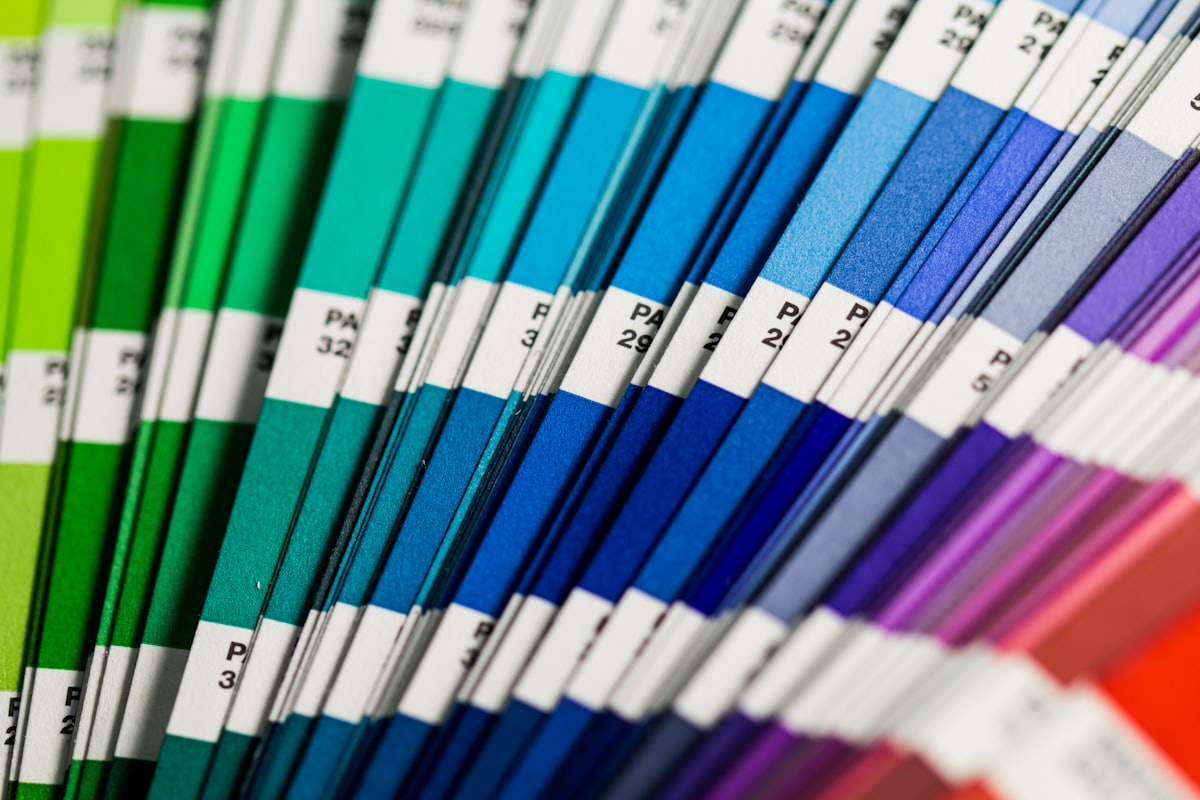
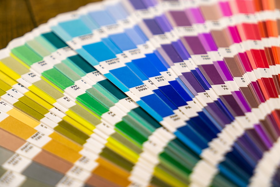
- Tighten the palette to your brand. Most demos ship with a color or two that has nothing to do with you. Pick your real brand color, apply it consistently, and delete the rest. One confident accent color reads as intentional. Three random ones read as a default nobody touched.
- Swap the default font pairing. The typeface is the voice of the page, and demo fonts are chosen to be safe and forgettable. Changing even the headline font shifts the whole feel of a site. You do not need to be a typographer. Pick one pairing that suits your business and apply it everywhere.
- Cut sections you do not need. A template gives you a testimonials block, a stats bar, a newsletter signup, a team grid. You may not have testimonials yet. Delete the block. An empty or faked section is worse than no section. A shorter, honest page beats a long one padded with demo filler.
- Write the copy in your own voice. The demo text is placeholder. Replace all of it, and do not write it like a brochure. Write like you talk to a good customer. Specific, plain, a little bit human. This is where your business stops sounding like a template and starts sounding like you.
None of that requires design skill. It requires a couple of hours and the willingness to not ship the demo.
The template is scaffolding, not the building
I keep coming back to this. The template decides where things sit and how the page holds together on a phone. It does not decide your identity. Your photos, colors, words, and the sections you chose to keep do that. Two businesses can buy the same template and end up looking nothing alike, because the interesting layer is the one they added on top.
If you are still deciding what kind of site you even need, the store is sorted by shape, which helps. A portfolio layout, an online store, or a simple landing page are very different starting points, and starting from the right one saves you fighting the template later.
My real advice: choose the plainest template that still moves you a little. That restraint you might read as "boring" in the demo is exactly what gives your own brand room to come through. The flashy option dates faster and fights you harder.
And if you would rather not do the shaping yourself, or you want something built around your business from the start instead of adapted from a demo, tell us what you are working on and we will point you at the right starting place. When you are ready to look, browse the store with one question in mind: does this leave me room to make it mine?
Ready when you are.
Browse the storeGet the next one in your inbox
Occasional, practical notes on building sites that sell. No spam, unsubscribe anytime.
Keep reading

AI Agents That Write Code: What They Do Well and Where They Fail
An honest field report from a studio that uses coding agents every day. Where they genuinely help, where they still fail, and how we keep the wheel.

What AI Will Actually Change in the Next Five Years (and What It Won't)
A grounded take from a small studio on the AI changes that are already real and compounding, and the ones that are mostly noise.